As expectations for a richer user experience continue to increase, the use of relevant images on your website is a must for developing a higher level of user engagement. Engaged website visitors translate to better adoption, increased revenue, and higher conversion rates for online businesses.
If you were ever in doubt of the significant impact of relevant images on user engagement, just consider the following facts.
- Adding relevant images increases information retention from 10% to 65%.
- 80% of people skim content when reading online, processing visuals 60,000 times faster than text.
- People who follow illustrated instructions do 323% better than those who just read text.
- People will spend 10% more time looking at visuals on a website than reading text.
- Posts that include images produce 650% higher user engagement than text-only posts.

These facts could lead us to conclude that the more images, the better. However, we also know that website speed performance-or the time a visitor waits for your pages to fully load-also has a significant impact on the user experience. Not only will slow pages cost you a loss of revenue; it will also be penalized by search engines, having an impact on your ranking, both on mobile and desktop devices. Amazon has claimed that if their pages were to slow down by just one second, they would lose $1.6 billion a year!
Image load time is one of the top reasons that web speed performance gets bogged down.
This is when image optimization enters the equation.

Image optimization is the process of reducing the file size of your images to retain their quality while keeping your page load time low and increasing your overall web speed performance. And, if done properly, image optimization can also be about increasing your image SEO by getting your images to rank on Google and other image search engines.
Let’s start with a few basic tips on image optimization.
- Name your images with descriptive, relevant, and helpful keywords; preferably those that your analytics show your visitors using.
- Optimize your alt attributes by including model numbers, product serial numbers, or other descriptive keywords users search for.
- Reduce the file size of your images by understanding file formats and when best to use a GIF, JPEG, or PNG—or even the new WebP format introduced by Google.
- Optimize thumbnail images by making them as small as possible and giving them different alt text from their larger counterparts.
- Use image sitemaps to help Google find the images you’re displaying through galleries or pop-ups and increase your image SEO.
- Simplify and minimize your decorative images possibly by using CSS.
- Consider a Content Delivery Network (CDN) to help with bandwidth issues.
- Test your images to see what increases conversion. How many product images is optimal? How many product listings should be in a category page?
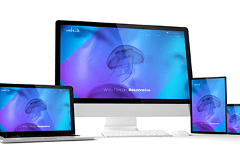
Effective image optimization gets more involved with the adoption of Responsive Design.

Responsive web design is the approach to web design that makes web pages render well on a variety of devices and window or screen sizes. Content, design and performance are necessary across all devices to ensure usability and engagement.
With more and more visitors browsing the web over mobile devices, the need to serve visitors a rich, consistent experience is met with the challenge of increased diversity across the web delivery options.
Since images are a key component of content and design, we need to understand the following image optimization concepts.

- Display size
As display sizes vary from device to device, so does the optimal width and height of your images. Do not use one large image and scale it via the IMG element. Instead, determine the optimal width and height for image display on the different end-user devices (desktop, laptop, tablet, smartphone) and generate and store each size. Then serve the appropriate size via conditional logic. - Resolution
Almost all screen resolutions range from 72 PPI (pixels per inch) to 100 PPI. There is no need to serve a 300 DPT (dots per inch) resolution image that you used for your print collateral. - Synchronously load
If your web page is synchronously loading all HTML, CSS, JavaScript, and images together, the initial render time for your page will be very high. Defer loading images and instead load them asynchronously after the necessary code has been loaded. This method will also reduce the number of HTTP requests during the initial page load.
Creating all these different, optimized images for your Responsive Design takes us from image optimization to image management.
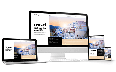
Image management includes clicking on pictures, editing, resizing per layout, optimizing, and delivering them to end users as fast as possible. The goal of an effective image management strategy is to improve development productivity, speed your website to market, and find a way to avoid creating multiple versions of each image to support responsive design.
In addition to optimizing your images, here are 3 best practices of an image management strategy.
- Simplify image workflow with URL-based resizing.
Image workflow is every step taken from the creation of an image to its uploading to a CMS. The time and effort the design team put into creating multiple size variants for images can get obliterated instantly by someone in Marketing uploading a huge image that degrades the user experience. This is how real-time image manipulation is key to saving lots of time and simplifying the workflow. - Increase web speed performance by using HTTP/2 instead of HTTP/1.1.
HTTP/1.1 requested images sequentially or created several parallel connections. The new HTTP/2 allows for the browser to make a single connection to the server and optimizes the requests to all images over a single connection. - Leverage CDNs for globally distributed caching.
Content Delivery Networks support faster page loads. Faster page loads ultimately lowers abandonment rates, improves conversion rates, and strengthens customer loyalty—increasing the overall user experience.
Does the thought of creating an image management system on your own sound overwhelming? The good news is that there are CMS and Image Management System solutions already made you can use right away.
When evaluating which is the right system for you, choose one that allows you to:
- Upload images easily from a browser, mobile app or any application directly to the cloud without requiring you to build and maintain your own infrastructure.
- Store images securely in the cloud with multi-region backups, revision history and disaster recovery.
- Manage your ever-growing media library by organizing files, controlling user access, and monitoring usage and performance.
- Use a URL-based API to manipulate, enhance, and optimize images from cropping and scaling to transcoding and enhancing your original images on-the-fly, delivering the most optimal asset to every user, every time.
- Automate image optimization by focusing on the most important region of the image, selecting optimal quality, encoding settings, and delivering the image on any device in any resolution or pixel density.
- Efficiently deliver images to users globally via multiple Content Delivery Networks without having to handle the integration nor maintaining configuration sync and load balancing across different networks.
Consider looking into https://www.akamai.com/ or https://cloudinary.com to learn more about image management systems available to you.
Have you evaluated how your Image Management approaches Image Optimization to support your Responsive Design?

As communications become predominantly visual, your website design must incorporate image management best practices that balance the need for high-quality images, fast loading pages, and a rich user experience. And it must do so efficiently to ensure ROI.
Don’t know where to start? Let’s assess where you are right now in terms of your image management strategy and where you would like to take it. Our expertise in effective responsive design will help lay out a step-by-step strategic plan to meet the business goals of your website.
We can help. Let’s discuss how you can build a systematic approach to keeping your website with as high a conversion rate as possible. Consider our Free Website Assessment to get started.