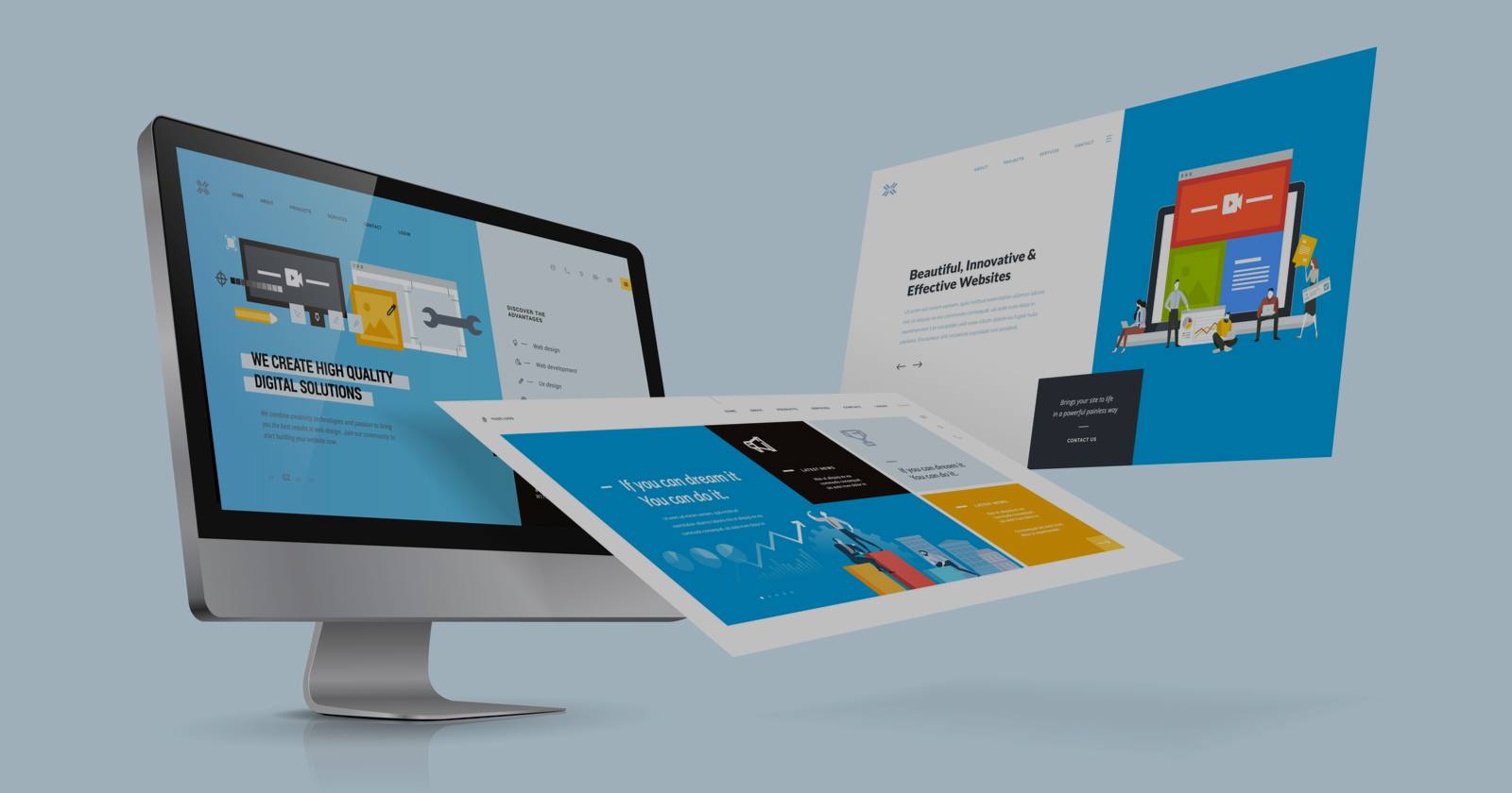
Website Design Services
Bring your brand to life.

Setting New Standards in Website Design
Moonstone Interactive, a San Francisco Bay Area-based web design company, is a trailblazer in digital design and development. Our innovative approach to providing comprehensive website design services reflects a commitment to technological prowess, creativity, and attention to detail. Our dedicated team of web design professionals excel at creating state-of-the-art, responsive websites that are visually appealing but also functional and user-friendly. With our services, we aim to balance aesthetics and functionality, offering solutions tailored to the unique requirements of the rapidly evolving digital landscape. We set new standards for the industry by delivering websites that not only fulfill the needs of businesses today but are also flexible and adaptable to the challenges of tomorrow.
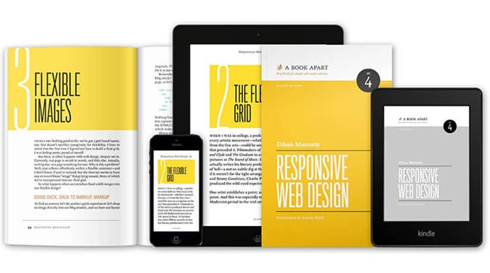
The Benefits of Responsive Design
With increasing internet users accessing the web from mobile and tablet devices, responsive web design has become more critical than ever. Moonstone Interactive's website design services offer a wide array of benefits inherent in responsive design:
Enhanced User Experience: A responsive design adapts to the user's device, providing a smooth and consistent experience across different platforms. Responsive design enhances the user's perception of your brand and improves their overall website experience.
Improved Brand Image on Mobile Devices: A responsive website ensures that your brand is presented in the best possible way on every device, enhancing your brand image and reputation.
Adherence to Best Practices: We stay current with web design and development trends and best practices. We ensure that your website is visually appealing, structured, and coded in a way that meets industry standards.
Compatibility with Various Devices: Our responsive designs ensure your website is compatible with various devices, including iOS and Android smartphones and tablets. Responsive design guarantees a seamless user experience for all visitors to your site.
Increased Mobile User Engagement: With a responsive design, mobile users will engage more with your site, reducing bounce rates and increasing the likelihood of conversions.

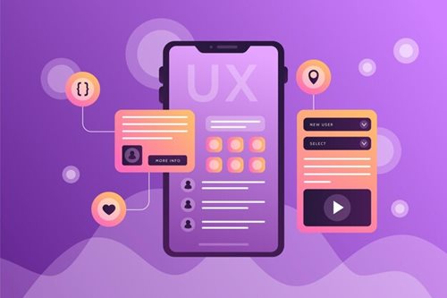
Making a Mark with Good User Experience
At Moonstone Interactive, we firmly believe that a successful website provides an outstanding user experience. Our approach to website design services strongly emphasizes designing and developing interfaces that are easy to navigate, intuitive, and responsive across various devices. We recognize that a positive user experience is instrumental in retaining and attracting new customers. Thus we will design your website to perform optimally on all screen sizes. If potential clients cannot properly view your website on their smartphone or tablet, they will likely turn to your competitor instead. Therefore, we prioritize responsiveness and ability in our designs, ensuring your website looks and works perfectly on all devices. We work tirelessly to satisfy industry best practices for readability, navigation, and accessibility, always striving for the highest quality in our projects. We aim to provide our clients with a platinum standard of service and a superior user experience that exceeds expectations.

Responsive Web Design: A Multi-Device Solution
In the digital age, where people access the internet using various devices, a successful website must adapt to any screen size or platform. That's where Moonstone Interactive comes in. Our website design services include responsive web design, a design approach that automatically resizes, repositions, and optimizes page layout to offer the best viewing and interaction experience on any device. Whether your visitors use a desktop computer, laptop, tablet, or smartphone, your website will adjust seamlessly to their screen, providing an optimal user experience. As a leading provider of responsive web design services, we take pride in ensuring your website delivers a consistent, high-quality user experience across all devices. We maintain a sleek and professional design, a user-friendly interface, and efficient performance regardless of the screen size or platform.

Higher Engagement, Greater Return
Our website design services at Moonstone Interactive go beyond creating visually appealing websites. We focus on designing and developing websites that encourage user engagement and foster return visits. We understand that a website that is easy to use and navigate creates a positive user experience, leading to higher levels of user interaction. Our intuitive and user-focused designs aim to captivate and keep your audience engaged. This user-centric approach boosts engagement and increases the chances of return visits, especially on mobile devices. We create websites that leave lasting impressions, encouraging users to return and explore further, improving your site's retention rates.

Responsive Design for SEO and Cost-Effectiveness
Responsive web design has implications beyond the user experience – it also has significant SEO benefits. We design your website in a manner optimized for search engines. Search engines rank mobile-friendly websites higher in search engine results, especially for mobile searches. Thus our responsive websites enhance your online visibility and drive more organic traffic. Furthermore, by opting for a responsive design, you can reduce the costs of maintaining separate websites for different devices. Our website design services are cost-effective for businesses of all sizes, providing you with a high-quality, multi-device-compatible website without needing multiple versions.

Choose Moonstone for Outstanding Web Design Services
Selecting Moonstone Interactive for your website design services means choosing a team of dedicated, experienced professionals who are committed to delivering outstanding results. We recognize that your online presence is integral to your brand's identity and your business' success. We work to ensure your website isn't just another address on the web. It is a powerful digital tool that serves your business goals, communicates your brand values, and delivers an exceptional user experience. Trust us to provide a design that is aesthetically pleasing, functionally robust, and packed with features that keep your visitors coming back time and again. With Moonstone Interactive, you get more than just a website – you get a unique digital presence that reflects your brand's identity and helps you connect with your audience in meaningful ways.
.webp?ext=.webp)