
We’ve all been there. We’ve searched for something on Google, found the page we wanted and clicked on it, only to be taken to a mobile only website that is missing that specific page. Sure, you have the option to view the full site, but it just takes you to the homepage. If you go back to your Google search results to find the page you wanted and click on it, you’re back in the mobile website again. Nothing is more frustrating.
This is only one of the problems with mobile-only websites. In this article, we’re going to look at why responsive web design is better than mobile only design and the benefits of having a design that works anywhere.
The Trouble with Mobile-Only Websites
So aside from the opening issue of not being able to support all of your pages if you have a large website, what are some other issues that your users will run into with a mobile-only website? Here are a few scenarios.
Inconsistent Experience
When a visitor goes to your website on their desktop, they get familiar with it. Unfortunately, if you have a mobile-only website, that familiarity is lost with a new layout, different functionality, and as mentioned earlier, lack of certain subsets of content.
Sharing Mismatches
Let’s say that your visitors are mobile-only users who like to share things they find online with their social media connections. When they share a page on your mobile-only website, and a connection opens it on their desktop, most of the time they are not forwarded to the full site version, but he mobile version, which tends to be missing a lot for non-mobile browsers.
More Content Updates
If your mobile-only site is completely independent of the full version of your website, guess what? Each time you update one you’ll have to update the other. This means twice the updates, and the possibility that you’ll miss one at some point, sending different messages to different audiences.
Why You Need Mobile-Friendly Websites
Just because there are challenges to the mobile-only versions of websites does not mean you need to give up on the theory of implementing a mobile-friendly website. If you don’t think you need a mobile-friendly website, then just take a tour through your own Google Analytics data. Look at your visitor data from 2013 compared to 2012 and go to the Mobile Overview section.
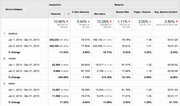
There’s a good chance that you’ll see a drop in desktop visitors, and an increase in mobile and tablet visitors. It could be a slight change, or a dramatic change. Either way, if you do not have a mobile-friendly website, you’re going to also see less than desirable behavior statistics for your mobile visitors compared to your desktop visitors, including a higher bounce rate (number of people who leave your website after viewing only one page) and lower time on website overall.
If you don’t have enough web analytics data to backup your need for a mobile-friendly website, consider these industry statistics.
- 57% of people will not recommend a business with a poorly designed mobile site. (The Mobile Playbook)
- 40% of people have turned to a competitor’s site after a bad mobile experience. (The Mobile Playbook)
- 77% of mobile searches occur at work or home, even when a desktop is nearby. (Search Engine Land)
- 81% of people prefer using mobile for convenience and speed. (Vocus)
Those are only a few of the many mobile statistics, but overall, mobile usage is increasing each year. Therefore, your business needs to be mobile-friendly. Just not mobile-only.
Why Responsive Web Design is the Answer
Responsive web design is simply one web design that works on any device. It gives your visitors a consistent experience on your website, whether they view it on their desktop, iPad, iPhone, iOS, Android, or Windows device.
Responsive web design alleviates the problem with finding a page in search results, but not on your mobile website because every page on your website will work on any device a web searcher could possibly be using.
The ability to have a consistent experience and deliver all of your content to visitors using any device at any time gives you the opportunity to convert more visitors. Someone who discovers your website on their desktop and decides to subscribe or make a purchase later while standing in line at the grocery store can do so as they will be able to access all of your calls to action throughout your website on their smartphone, just as they did on their desktop.
Moonstone Interactive believes that responsive web design will ultimately lead to stronger branding definition across all devices, better differentiation from your competitors, and an overall higher ROI from visitors, no matter what device they use. If you’re ready to move to a responsive web design that will meet your business objectives, learn more about our web design services and request a free consultation today!